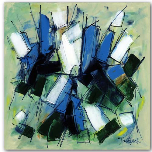
My Latest Painting: Signs And Signals

This new painting evolved over many steps with the application of layers of acrylic paint.  I first worked on a background which consisted of blending a number of colors very loosely with a wet brush:

Signs and Signals, Step 1

Signs and Signals, Step 1

The next two steps involved drawing lines of color across the canvas--first with one orientation, then turning the canvas 90 degrees and drawing more lines. 


Signs and Signals, Step 2 and 3

Signs and Signals, Step 2 and 3

In the next stages of the process, I began filling in some of the shapes that were created by the intersecting lines.  I used a pale beige, very pale yellow, dusky green, teal, and a reddish orange.  These painted sections then popped forward from the background, providing a path for the eye to follow.

Signs And Signals, Step 4

Signs And Signals, Step 4

At this point I wasn't sure what I wanted to do, but took the plunge and added some texture by drawing straight, zig-zag, and circular lines on several sections of the canvas.

Signs And Signals, Step 5

Signs And Signals, Step 5

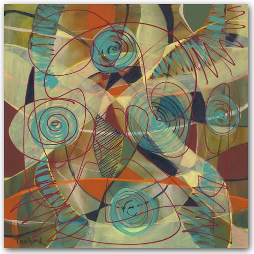
Now I had no idea what to do next.  I liked what was there so far, but the painting still felt "unfinished" to me.  So I took a radical step.  I mixed the pale yellow with water and gloss medium to make it translucent, and then painted over large sections of the canvas.  Next, I dipped my brush into a thin, light teal and brushed that on the swirls inside the circular shapes.  I also added it in zig-zag lines across some of the other shapes. 

Finally, I took a deep cadmium red and drew somewhat random lines across the canvas.  Wow.  This turned out to be a painting unlike any I'd ever done!  Here it is:  Signs And Symbols.

The Evolution of An Abstract Painting

As I worked on a new 30" x 30" abstract painting over several days, I took photos of it along the way.  It was not a painting that came easily, and I'm still not sure if it's "finished."  I will let it sit for a while before I sign it. 

Here's the process step by step:

Step 1I began by painting the whole canvas in a light lemon yellow, which comes across with a tint of green in this photograph.  I was working loosely, brushing on some cadmium red deep, green gold, and a pale green here and there, blending the…

Step 1

I began by painting the whole canvas in a light lemon yellow, which comes across with a tint of green in this photograph.  I was working loosely, brushing on some cadmium red deep, green gold, and a pale green here and there, blending them in.

Step 2I added a lot more color here:  cadmium red light, Prussian blue, and cadmium yellow medium.  I also added in more of the pale green.  Again, I painted loosely, working in an overall fashion to develop the composition.  The…

Step 2

I added a lot more color here:  cadmium red light, Prussian blue, and cadmium yellow medium.  I also added in more of the pale green.  Again, I painted loosely, working in an overall fashion to develop the composition.  Then I drew lines in Prussian blue and brushed over them lightly to soften the effect.

Step 3At this stage I drew sketchy lines with burnt sienna, and then brushed over them to blend them a bit with the background colors.  I also used the pale yellow background color to soften a lot of the brighter yellows.  Finally, I drew …

Step 3

At this stage I drew sketchy lines with burnt sienna, and then brushed over them to blend them a bit with the background colors.  I also used the pale yellow background color to soften a lot of the brighter yellows.  Finally, I drew more lines with the Prussian blue.  At this point I might have called the painting "finished."  It felt good to me in many ways.  But it wasn't quite there yet.

Step 4I took a bold move here which changed the painting drastically and might not have worked:  I filled in spaces with small circles of color:  light Hansa yellow, medium yellow, and orange.  I also added more cadmium red light in p…

Step 4

I took a bold move here which changed the painting drastically and might not have worked:  I filled in spaces with small circles of color:  light Hansa yellow, medium yellow, and orange.  I also added more cadmium red light in places, and more of the pale green.  The image was now becoming more dense and solid.  But it felt like I'd gone in the right direction.

Step 5In this final step, I first painted the outer yellow area with cadmium yellow medium.  That created a kind of "frame" for the central image.  Then I began to fill in some of the small circles of color--first some orange, and then som…

Step 5

In this final step, I first painted the outer yellow area with cadmium yellow medium.  That created a kind of "frame" for the central image.  Then I began to fill in some of the small circles of color--first some orange, and then some of the Hansa yellow.  Now I have to step back and study the canvas.  The outer more golden yellow may be too strong.  I might have contrived and controlled too much and lost too much of the sketchiness I had at the beginning. 

The Challenge of Painting Narrow Rectangular Canvases

I had always thought the shape that made the most sense for abstract paintings was a square, since it didn't suggest any particular subject matter.  In fact, most of my paintings are square.  But when the director of a gallery asked me to paint what he called "slice" paintings on narrow, 10" x 48" canvases, I gave it a shot.

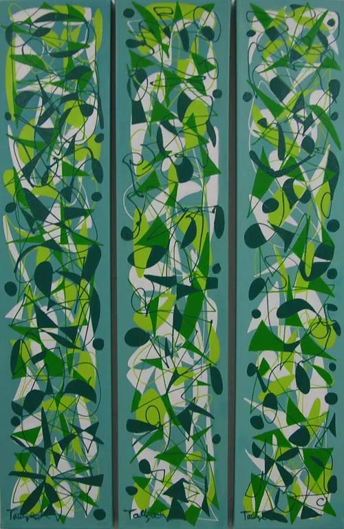
I found myself making patterned images that could be carried over from one slice to the next.  That would allow a collector to hang two or more next to each other, creating a diptych or triptych, for example.  This one is called Pecking Order Triptych.  I worked on all three panels at the same time so that the colors and designs would be similar, yet varied in each one.


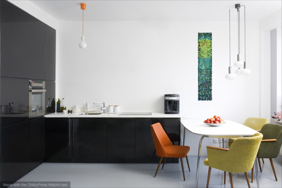
I think that sometimes a 10" x 48" painting might be just what is needed to fill a space, either horizontally or vertically.  I tried out this idea using WallAp by OhMyPrints.  It allows you to show a painting in various rooms to get an idea what it might look like in your own home.

Now I'm in the process of stretching more 10" x 48" canvases, and looking forward to working on them. 

Contemporary Paintings on Paper

Making contemporary paintings on paper instead of on stretched canvas takes some getting used to, since the texture of the surfaces is different.  The advantage of working on paper is that it is less expensive than canvas, but the final result then needs to be framed before it can be hung.

When I paint on canvas, I use gallery-wrapped canvases that are one and a half inches thick.  I paint the image around the sides of the canvas so that they can be hung without being framed.  Thus, I have no framing problem.

Paintings on paper are another story.  While I have made my own mats and frames in the past, this part of the process is really not my forte.  So I sell the paintings unframed, or use a framer downtown if my client wants their selection framed. 

Swept Away, 24" x 18" acrylic on watercolor paper.

Swept Away, 24" x 18" acrylic on watercolor paper.

Painting on paper is freer in some ways, once you get used to working with the painting surface.  By mixing the paint with water, you can get transparent and translucent effects similar to watercolors

Contemporary Art Twenty-Six, 24" x 18" acrylic on watercolor paper.

Contemporary Art Twenty-Six, 24" x 18" acrylic on watercolor paper.

Recently I think I found a solution to the framing problem.  I found pre-cut mats and ready-made metal frames that work well with my contemporary art.  They would allow me to offer framed paintings at a reasonable price. 

Now I'm trying to figure out how to represent the framed paintings digitally on my website.  I'm still working on that one.

Update:  An hour after posting this, I figured out how to show the painting framed using Photoshop.  See pic below:

Swept away, matted and framed.  Outside dimensions 28" x 22". 

Swept away, matted and framed.  Outside dimensions 28" x 22". 

Abstract Pattern Paintings

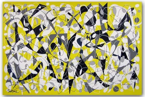
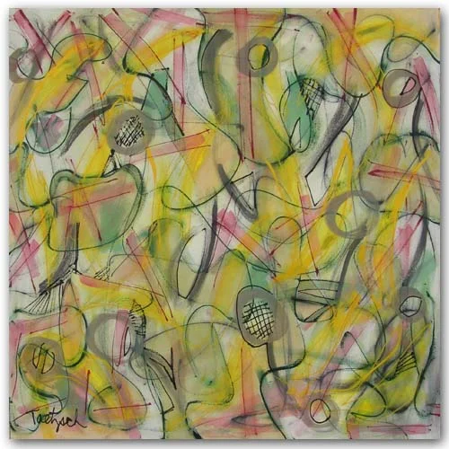
Recently I've been interested in the patterns made with overlapping lines that can be filled in with color to draw the eye across a canvas.  I usually begin by painting a solid background color and letting it dry before beginning to draw the lines.  In "Concatenation," I painted the whole canvas yellow.  Then I drew lines in white, gray and black. 

I was conscious, while filling in spaces with white, gray and black paint, of the patterns and connections being made between shapes.  There are various paths set up, depending on whether you follow the white, the gray, or the black connections. 

Concatenation, 60" x 40" 

Concatenation, 60" x 40"


In "Pecking Order Triptych," I painted three vertical canvases, each 10" x 48," in a light teal for the background.  Then I drew the lines in white, lime, teal and Prussian Blue.  I worked on all three canvases at once, developing each color pattern on all three before going to the next color.  By working on them all at the same time, I was able to ensure that the three panels would work together as a whole when hung side by side.  They also work if spaced further apart, depending on the room and space they are hung.

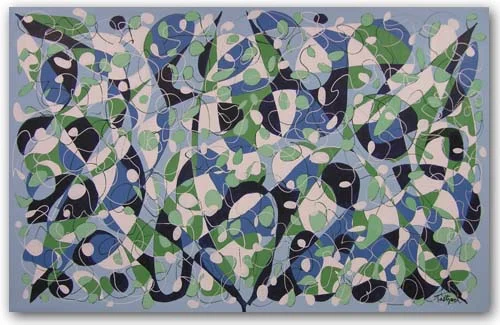
In "Sea Escape," which is a very large canvas (72" x 46"), I painted the background a light blue.  Then I drew lines in white and Prussian Blue.  This painting was more problematic, perhaps because of its large size.  I filled in spaces with white, pale green, a darker green, a medium blue, and Prussian Blue.  Sometimes I had to paint over one color because it didn't work.  Finally, I felt I'd gotten to the point where the image worked as a whole as well as in its parts. 

Sea Escape, 72" x 46"

Sea Escape, 72" x 46"

Which of the above abstract pattern paintings do you think is most successful?  Which one appeals to you the most?

Abstract Artist Linda Jaekel

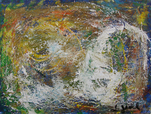
Linda Jaekel is an abstract artist living near me in Ithaca, New York.  Her work has a lot of texture, which she achieves by using various tools other than brushes to paint with.


Stratosphere, 24" x 18"

Stratosphere, 24" x 18"

Linda grew up in the San Francisco and New York City areas and has been making art since she was a young child.  She won her first art contest at the age of five from the San Francisco Chronicle.

Linda says, "I explore the ways of creating a peaceful beauty out of chaos, but I leave a portion of chaos for the viewer to use to create their own story. "

Linda currently works with acrylic paints on canvas and paper.  You can find her paintings on her own website, or at Vangoart.com.

How to Appreciate Abstract (non-representational) Art

In a non-representational painting, I am not attempting to capture the likeness of a landscape or figure. My subject is the painting itself.

What do you actually see when you look at the painting? Color, shape, line and texture are the physical elements that combine to make up the image. A selection of dark, heavy shapes may impress you as somber--light, airy images as mystical--balanced, temperate forms as peaceful. Shape, color and form have meaning in and of themselves. We react emotionally to these elements even if they create no recognizable object for us to hang onto. Thus, a painting of ragged, angular forms in deep reds will evoke an entirely different feeling from one in soft curves of yellow and white.

The handling of space--or the illusion of space--is another element in the artist's toolbox. Are you drawn into a world of three-dimensional space stretching beyond the framework of the painting, as you might be in a landscape? Or are you kept visually taut, as a skater on a pond, skimming across a two-dimensional surface? The impression of depth, perspective, airiness, solidity, and other spatial relations are created and controlled by the artist.

Looking UP

Looking UP

The overall composition or design of a painting is what guides the viewer's eye. Have you ever looked at a painting or photograph and felt it was off balance? One of the big differences between amateur snapshots and professional photographs is the quality of the composition. In an amateur photo, perhaps all the action is centered on the left, with nothing but empty space on the right. The lopsidedness gives you a sense of unease. (Of course an artist may use this unease deliberately as well.)

Composition is one of the fundamental tools an art student is taught. The goal is to have a balance of visual elements without making the weight so balanced that the art becomes boring. If everything on the left is exactly equal to the right, and the top to the bottom, you may have balance, but you lose interest.

Getting the composition right, or balancing the elements of color, line and shape while maintaining a dynamic tension is a major preoccupation of the painter. If you add a blue brushstroke to the bottom left-hand corner, for example, you may have to change something in the top right-hand corner because of it. You can't concentrate on one section at a time, ignoring the rest of the canvas, and expect to end up with a composition that works.

With Fresh Eyes

With Fresh Eyes

Energy is the life force that is present in all good art. This is not something that is easily defined, but it is the opposite state of static flatness. It is this energy that makes a painting speak to you, and makes an artist's work original and identifiable as the work of that artist. Energy is created out of the artist's materials and tools, but the end is more than the means in the same sense that a musical composition is so much more than a collection of notes.

The next time you look at an abstract painting, or any kind of "modern art," don't begin by searching for some identifiable object from your world. Instead, try to enter the world the artist created. Relax and let your eye leisurely wander over the painting's surface. Let your heart and mind react to its colors, shapes, and textures. Let yourself be drawn into the illusion of its spaces, the action of its lines, the mood of its atmosphere.

Step back and look at the painting from a distance. What is its impact as you approach it?

Move up close and explore the intricacies of brushstrokes, paint thicknesses and compositional details. See how the parts are woven together to form the whole.

Give the painting time. No artwork can be understood and appreciated in a ten second glance. Good art should grow on you, becoming more interesting and more enjoyable to look at as you live with it.

You may still see things in abstract paintings, finding birds and trees and animals hidden in the forms. This is as natural as turning clouds into recognizable shapes. But by opening your eyes to the possibilities of the world the artist created, you may see more than you ever expected to see in abstract art.