My Latest Painting: Signs And Signals

This new painting evolved over many steps with the application of layers of acrylic paint.  I first worked on a background which consisted of blending a number of colors very loosely with a wet brush:

Signs and Signals, Step 1

Signs and Signals, Step 1

The next two steps involved drawing lines of color across the canvas--first with one orientation, then turning the canvas 90 degrees and drawing more lines. 


Signs and Signals, Step 2 and 3

Signs and Signals, Step 2 and 3

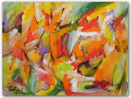
In the next stages of the process, I began filling in some of the shapes that were created by the intersecting lines.  I used a pale beige, very pale yellow, dusky green, teal, and a reddish orange.  These painted sections then popped forward from the background, providing a path for the eye to follow.

Signs And Signals, Step 4

Signs And Signals, Step 4

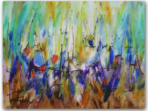
At this point I wasn't sure what I wanted to do, but took the plunge and added some texture by drawing straight, zig-zag, and circular lines on several sections of the canvas.

Signs And Signals, Step 5

Signs And Signals, Step 5

Now I had no idea what to do next.  I liked what was there so far, but the painting still felt "unfinished" to me.  So I took a radical step.  I mixed the pale yellow with water and gloss medium to make it translucent, and then painted over large sections of the canvas.  Next, I dipped my brush into a thin, light teal and brushed that on the swirls inside the circular shapes.  I also added it in zig-zag lines across some of the other shapes. 

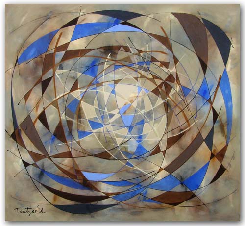
Finally, I took a deep cadmium red and drew somewhat random lines across the canvas.  Wow.  This turned out to be a painting unlike any I'd ever done!  Here it is:  Signs And Symbols.
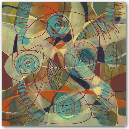
Painting On Demand

Over the years I've painted many commissions, and most of them have turned out successfully.  Often someone will like a painting that's already been sold, or want one in a different size or colors, and so forth.  I make it clear there will not be any duplicates because my abstract painting style is improvisational.  There is no way I can duplicate any of it.  What I can do is paint in a similar style and colors.

Here is an original painting called Open Focus:

Open Focus

Open Focus

And here is the commissioned painting made in a similar style and colors:

Commissioned Painting

Commissioned Painting

Still, painting commissions is not my favorite thing.  The pressure to achieve a particular result creates a barrier to the free exploration I like to use in the painting process. It is rare when I like the commissioned painting better than the original. 

One time a client sent me a photograph of their hotel and its surroundings.  In this case I made two paintings--one more realistic and one abstract in my usual style.  Of course they preferred the abstract--that's why they hired me, after all, and not a realistic painter.  But in a way, I needed to do the realistic version in order to get to the abstract one. 

What doesn't work for me at all is when a gallery or dealer suggests something totally new rather than a version of what I'm already doing.  These paintings often come out stilted and lifeless.  It would have been better to save my materials and time. 

Periodically I say I will never paint another commission. But then someone really wants me to do one, and I start to see it as a challenge.  Sometimes painting a commission of a painting I've done years ago reminds me of what it was about that particular style that interested me.  I get re-interested and end up exploring it further. 

So, while painting on demand is not my favorite thing, I guess I won't shut the door on it altogether. 

Hanging an Art Exhibit

Over the years I have hung or helped to hang many art exhibits in galleries and other spaces.  The shows I hung were usually of my own art, but last week I helped a good friend hang her abstract acrylic paintings in a downtown coffee shop in Ithaca, NY, called The Shop.

I prefer showing in galleries where the owner or curator selects, arranges, and hangs the art, but throughout an artist's career, especially when starting out, we take what opportunities come our way.  My friend Linda Jaekel is restarting her career after a hiatus, so she was happy to have this opportunity at the coffee shop.

Linda and the barista at The Shop

Linda and the barista at The Shop

Reviewing the space and the hanging mechanism is the first step in planning a show.  If you can put a nail in the wall, you have more options than other systems.  In The Shop, there are metal rods placed a few inches from the ceiling, an inch or two from the walls.  Metal hooks fit over the rods, and wire can be attached to the hooks at one end, then to the painting's hanging wire at the other. 

This meant that we had to have wired the paintings as close to the top of the canvas, and as tight as possible.  Otherwise the top of the painting would stick out at an angle from the wall.  We learned this on our first attempt to hang the show. 

Of course, before we got to that point, we decided where each painting would go on the walls.  It's important to make sure images work well together and fit the selected spaces.  Linda was very good at figuring this one out, and we only had to switch two paintings at the end to get it just right.  I'm more of a "trial and error" person, but even I would line them all up before I start.  Otherwise you could be at it all day.

It's a good idea to bring every tool you might possibly need, and a ladder, of course.  These fit in Linda's car, along with the eleven paintings we were hanging.  We found an empty table to set up our operation and began hanging in a section of the shop where no customers were sitting.  Using our skill strengths, we worked out a routine--I did the wiring and Linda got up on the ladder to hang the paintings. 

Two hours later, we looked with exhausted satisfaction upon the results of our work.

Linda and Lynne at The Shop with Linda's paintings.

Linda and Lynne at The Shop with Linda's paintings.

Contemporary Paintings on Paper

Making contemporary paintings on paper instead of on stretched canvas takes some getting used to, since the texture of the surfaces is different.  The advantage of working on paper is that it is less expensive than canvas, but the final result then needs to be framed before it can be hung.

When I paint on canvas, I use gallery-wrapped canvases that are one and a half inches thick.  I paint the image around the sides of the canvas so that they can be hung without being framed.  Thus, I have no framing problem.

Paintings on paper are another story.  While I have made my own mats and frames in the past, this part of the process is really not my forte.  So I sell the paintings unframed, or use a framer downtown if my client wants their selection framed. 

Swept Away, 24" x 18" acrylic on watercolor paper.

Swept Away, 24" x 18" acrylic on watercolor paper.

Painting on paper is freer in some ways, once you get used to working with the painting surface.  By mixing the paint with water, you can get transparent and translucent effects similar to watercolors

Contemporary Art Twenty-Six, 24" x 18" acrylic on watercolor paper.

Contemporary Art Twenty-Six, 24" x 18" acrylic on watercolor paper.

Recently I think I found a solution to the framing problem.  I found pre-cut mats and ready-made metal frames that work well with my contemporary art.  They would allow me to offer framed paintings at a reasonable price. 

Now I'm trying to figure out how to represent the framed paintings digitally on my website.  I'm still working on that one.

Update:  An hour after posting this, I figured out how to show the painting framed using Photoshop.  See pic below:

Swept away, matted and framed.  Outside dimensions 28" x 22". 

Swept away, matted and framed.  Outside dimensions 28" x 22". 

Abstract Pattern Paintings

Recently I've been interested in the patterns made with overlapping lines that can be filled in with color to draw the eye across a canvas.  I usually begin by painting a solid background color and letting it dry before beginning to draw the lines.  In "Concatenation," I painted the whole canvas yellow.  Then I drew lines in white, gray and black. 

I was conscious, while filling in spaces with white, gray and black paint, of the patterns and connections being made between shapes.  There are various paths set up, depending on whether you follow the white, the gray, or the black connections. 

Concatenation, 60" x 40" 

Concatenation, 60" x 40"


In "Pecking Order Triptych," I painted three vertical canvases, each 10" x 48," in a light teal for the background.  Then I drew the lines in white, lime, teal and Prussian Blue.  I worked on all three canvases at once, developing each color pattern on all three before going to the next color.  By working on them all at the same time, I was able to ensure that the three panels would work together as a whole when hung side by side.  They also work if spaced further apart, depending on the room and space they are hung.

In "Sea Escape," which is a very large canvas (72" x 46"), I painted the background a light blue.  Then I drew lines in white and Prussian Blue.  This painting was more problematic, perhaps because of its large size.  I filled in spaces with white, pale green, a darker green, a medium blue, and Prussian Blue.  Sometimes I had to paint over one color because it didn't work.  Finally, I felt I'd gotten to the point where the image worked as a whole as well as in its parts. 

Sea Escape, 72" x 46"

Sea Escape, 72" x 46"

Which of the above abstract pattern paintings do you think is most successful?  Which one appeals to you the most?

When A Painting Gets Stuck

Some years ago, after a long holiday break, I had trouble getting back into a painting I had begun earlier.  What was I thinking when I started this canvas? 

Who knows, not me.

The background on this painting was black with two-inch parchment stripes across it.  I had worked on it once or twice after that, and there was a design or pattern taking shape, but it seemed too amorphous.  What I like to do often is to bring order out of chaos while leaving in enough signs of the chaos to retain a sense of ambiguity or chance.  There is a delicate balance that I find if I'm lucky. 

The reason I bring "luck" into it is that you have to simply take the plunge and try something to see if it works.  If it doesn't, you can't simply "erase it" and start over.  Once you've made a major move on a painting, you are pretty much committed to making it work.  You're not going to be able to remove the last layer of paint without disturbing what was beneath it. 

Well, on this particular painting, I chose to use raw umber lines to outline the parchment shapes, thereby creating more definition and less chaos.  From there, I went on to feather those lines with a brush, and the painting did look much better at that point.  I could almost have signed it and moved on.

That might have been the wiser choice, but instead I kept working at further definition. That is, I went too far in the defining direction, which then left the amorphous background looking out of place or "wrong."  To sum it up, I destroyed the delicate balance I had going for me and now the painting was completely out of kilter.  There was no way to simply "tinker" with it to bring it into balance. 

I waited a day for the canvas to dry, and tackled it again.  This time, I had some success.

Here it is, finally finished: my "stuck" painting:

Ringed Migration, 40" x 40" (sold)

Ringed Migration, 40" x 40" (sold)

Abstract Artist Linda Jaekel

Linda Jaekel is an abstract artist living near me in Ithaca, New York.  Her work has a lot of texture, which she achieves by using various tools other than brushes to paint with.


Stratosphere, 24" x 18"

Stratosphere, 24" x 18"

Linda grew up in the San Francisco and New York City areas and has been making art since she was a young child.  She won her first art contest at the age of five from the San Francisco Chronicle.

Linda says, "I explore the ways of creating a peaceful beauty out of chaos, but I leave a portion of chaos for the viewer to use to create their own story. "

Linda currently works with acrylic paints on canvas and paper.  You can find her paintings on her own website, or at Vangoart.com.

How to Appreciate Abstract (non-representational) Art

In a non-representational painting, I am not attempting to capture the likeness of a landscape or figure. My subject is the painting itself.

What do you actually see when you look at the painting? Color, shape, line and texture are the physical elements that combine to make up the image. A selection of dark, heavy shapes may impress you as somber--light, airy images as mystical--balanced, temperate forms as peaceful. Shape, color and form have meaning in and of themselves. We react emotionally to these elements even if they create no recognizable object for us to hang onto. Thus, a painting of ragged, angular forms in deep reds will evoke an entirely different feeling from one in soft curves of yellow and white.

The handling of space--or the illusion of space--is another element in the artist's toolbox. Are you drawn into a world of three-dimensional space stretching beyond the framework of the painting, as you might be in a landscape? Or are you kept visually taut, as a skater on a pond, skimming across a two-dimensional surface? The impression of depth, perspective, airiness, solidity, and other spatial relations are created and controlled by the artist.

Looking UP

Looking UP

The overall composition or design of a painting is what guides the viewer's eye. Have you ever looked at a painting or photograph and felt it was off balance? One of the big differences between amateur snapshots and professional photographs is the quality of the composition. In an amateur photo, perhaps all the action is centered on the left, with nothing but empty space on the right. The lopsidedness gives you a sense of unease. (Of course an artist may use this unease deliberately as well.)

Composition is one of the fundamental tools an art student is taught. The goal is to have a balance of visual elements without making the weight so balanced that the art becomes boring. If everything on the left is exactly equal to the right, and the top to the bottom, you may have balance, but you lose interest.

Getting the composition right, or balancing the elements of color, line and shape while maintaining a dynamic tension is a major preoccupation of the painter. If you add a blue brushstroke to the bottom left-hand corner, for example, you may have to change something in the top right-hand corner because of it. You can't concentrate on one section at a time, ignoring the rest of the canvas, and expect to end up with a composition that works.

With Fresh Eyes

With Fresh Eyes

Energy is the life force that is present in all good art. This is not something that is easily defined, but it is the opposite state of static flatness. It is this energy that makes a painting speak to you, and makes an artist's work original and identifiable as the work of that artist. Energy is created out of the artist's materials and tools, but the end is more than the means in the same sense that a musical composition is so much more than a collection of notes.

The next time you look at an abstract painting, or any kind of "modern art," don't begin by searching for some identifiable object from your world. Instead, try to enter the world the artist created. Relax and let your eye leisurely wander over the painting's surface. Let your heart and mind react to its colors, shapes, and textures. Let yourself be drawn into the illusion of its spaces, the action of its lines, the mood of its atmosphere.

Step back and look at the painting from a distance. What is its impact as you approach it?

Move up close and explore the intricacies of brushstrokes, paint thicknesses and compositional details. See how the parts are woven together to form the whole.

Give the painting time. No artwork can be understood and appreciated in a ten second glance. Good art should grow on you, becoming more interesting and more enjoyable to look at as you live with it.

You may still see things in abstract paintings, finding birds and trees and animals hidden in the forms. This is as natural as turning clouds into recognizable shapes. But by opening your eyes to the possibilities of the world the artist created, you may see more than you ever expected to see in abstract art.