The Creation of CARNIVAL

My first step in this new painting was to give the 40" x 36" stretched canvas two coats of Titanium white acrylic mixed with a gloss medium.  After it dried thoroughly, I painted sections of it with Mars black:

Step 1

Step 1

In my next painting session, I mixed some shades of pale orange, yellow, light green and aqua.  With a brush, I painted over sections, applying the paint in a very loose, expressionist manner.  I also added some cadmium red light, diluted with water and gloss medium.  Then I used a palette knife to make two slashes of Titanium white.

Step 2

Step 2

When I worked on this canvas again, I realized I had lost a lot of the openness I'd created initially by filling in too much of the painting with color.  So I dipped my brush in the white paint mixture and began to selectively paint over sections in order to restore that sense of spaciousness:

Step 3

Step 3

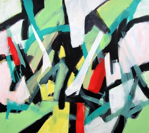
In this final stage of the painting, I first felt it needed more yellow, and added it selectively.  Then I gave myself license to add whimsical lines in white and black, which had a graffiti-like effect.  When I stepped back, I was satisfied:

Carnival, 40" x 30" x 1.5"

Carnival, 40" x 30" x 1.5"
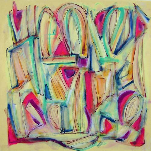
My Latest Painting: Signs And Signals

This new painting evolved over many steps with the application of layers of acrylic paint.  I first worked on a background which consisted of blending a number of colors very loosely with a wet brush:

Signs and Signals, Step 1

Signs and Signals, Step 1

The next two steps involved drawing lines of color across the canvas--first with one orientation, then turning the canvas 90 degrees and drawing more lines. 


Signs and Signals, Step 2 and 3

Signs and Signals, Step 2 and 3

In the next stages of the process, I began filling in some of the shapes that were created by the intersecting lines.  I used a pale beige, very pale yellow, dusky green, teal, and a reddish orange.  These painted sections then popped forward from the background, providing a path for the eye to follow.

Signs And Signals, Step 4

Signs And Signals, Step 4

At this point I wasn't sure what I wanted to do, but took the plunge and added some texture by drawing straight, zig-zag, and circular lines on several sections of the canvas.

Signs And Signals, Step 5

Signs And Signals, Step 5

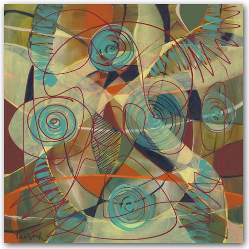
Now I had no idea what to do next.  I liked what was there so far, but the painting still felt "unfinished" to me.  So I took a radical step.  I mixed the pale yellow with water and gloss medium to make it translucent, and then painted over large sections of the canvas.  Next, I dipped my brush into a thin, light teal and brushed that on the swirls inside the circular shapes.  I also added it in zig-zag lines across some of the other shapes. 

Finally, I took a deep cadmium red and drew somewhat random lines across the canvas.  Wow.  This turned out to be a painting unlike any I'd ever done!  Here it is:  Signs And Symbols.

The Evolution of An Abstract Painting

As I worked on a new 30" x 30" abstract painting over several days, I took photos of it along the way.  It was not a painting that came easily, and I'm still not sure if it's "finished."  I will let it sit for a while before I sign it. 

Here's the process step by step:

Step 1I began by painting the whole canvas in a light lemon yellow, which comes across with a tint of green in this photograph.  I was working loosely, brushing on some cadmium red deep, green gold, and a pale green here and there, blending the…

Step 1

I began by painting the whole canvas in a light lemon yellow, which comes across with a tint of green in this photograph.  I was working loosely, brushing on some cadmium red deep, green gold, and a pale green here and there, blending them in.

Step 2I added a lot more color here:  cadmium red light, Prussian blue, and cadmium yellow medium.  I also added in more of the pale green.  Again, I painted loosely, working in an overall fashion to develop the composition.  The…

Step 2

I added a lot more color here:  cadmium red light, Prussian blue, and cadmium yellow medium.  I also added in more of the pale green.  Again, I painted loosely, working in an overall fashion to develop the composition.  Then I drew lines in Prussian blue and brushed over them lightly to soften the effect.

Step 3At this stage I drew sketchy lines with burnt sienna, and then brushed over them to blend them a bit with the background colors.  I also used the pale yellow background color to soften a lot of the brighter yellows.  Finally, I drew …

Step 3

At this stage I drew sketchy lines with burnt sienna, and then brushed over them to blend them a bit with the background colors.  I also used the pale yellow background color to soften a lot of the brighter yellows.  Finally, I drew more lines with the Prussian blue.  At this point I might have called the painting "finished."  It felt good to me in many ways.  But it wasn't quite there yet.

Step 4I took a bold move here which changed the painting drastically and might not have worked:  I filled in spaces with small circles of color:  light Hansa yellow, medium yellow, and orange.  I also added more cadmium red light in p…

Step 4

I took a bold move here which changed the painting drastically and might not have worked:  I filled in spaces with small circles of color:  light Hansa yellow, medium yellow, and orange.  I also added more cadmium red light in places, and more of the pale green.  The image was now becoming more dense and solid.  But it felt like I'd gone in the right direction.

Step 5In this final step, I first painted the outer yellow area with cadmium yellow medium.  That created a kind of "frame" for the central image.  Then I began to fill in some of the small circles of color--first some orange, and then som…

Step 5

In this final step, I first painted the outer yellow area with cadmium yellow medium.  That created a kind of "frame" for the central image.  Then I began to fill in some of the small circles of color--first some orange, and then some of the Hansa yellow.  Now I have to step back and study the canvas.  The outer more golden yellow may be too strong.  I might have contrived and controlled too much and lost too much of the sketchiness I had at the beginning. 

The Challenge of Painting Narrow Rectangular Canvases

I had always thought the shape that made the most sense for abstract paintings was a square, since it didn't suggest any particular subject matter.  In fact, most of my paintings are square.  But when the director of a gallery asked me to paint what he called "slice" paintings on narrow, 10" x 48" canvases, I gave it a shot.

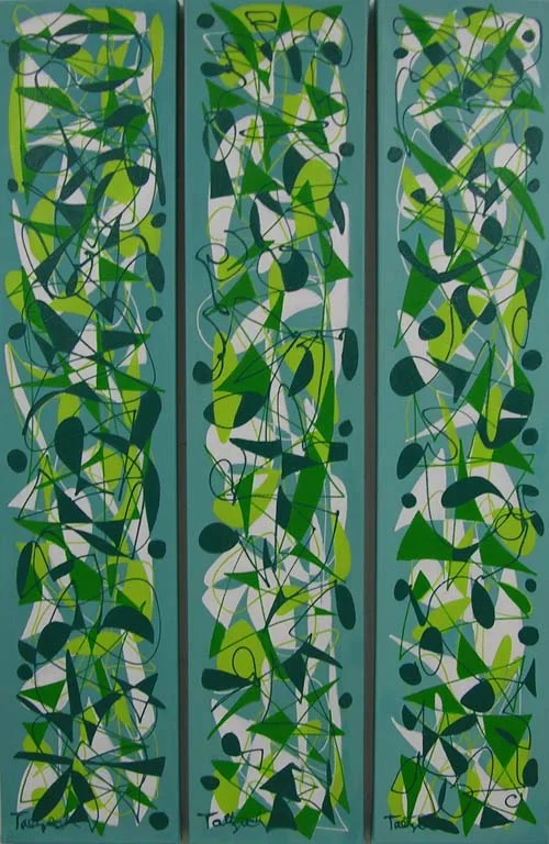
I found myself making patterned images that could be carried over from one slice to the next.  That would allow a collector to hang two or more next to each other, creating a diptych or triptych, for example.  This one is called Pecking Order Triptych.  I worked on all three panels at the same time so that the colors and designs would be similar, yet varied in each one.


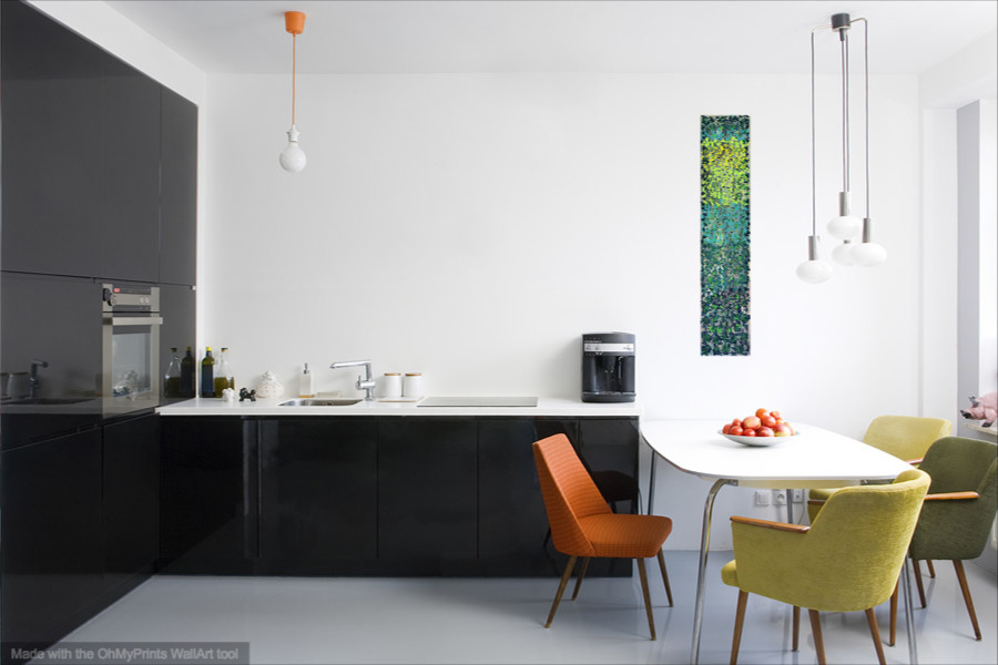
I think that sometimes a 10" x 48" painting might be just what is needed to fill a space, either horizontally or vertically.  I tried out this idea using WallAp by OhMyPrints.  It allows you to show a painting in various rooms to get an idea what it might look like in your own home.

Now I'm in the process of stretching more 10" x 48" canvases, and looking forward to working on them. 

Painting On Demand

Over the years I've painted many commissions, and most of them have turned out successfully.  Often someone will like a painting that's already been sold, or want one in a different size or colors, and so forth.  I make it clear there will not be any duplicates because my abstract painting style is improvisational.  There is no way I can duplicate any of it.  What I can do is paint in a similar style and colors.

Here is an original painting called Open Focus:

Open Focus

Open Focus

And here is the commissioned painting made in a similar style and colors:

Commissioned Painting

Commissioned Painting

Still, painting commissions is not my favorite thing.  The pressure to achieve a particular result creates a barrier to the free exploration I like to use in the painting process. It is rare when I like the commissioned painting better than the original. 

One time a client sent me a photograph of their hotel and its surroundings.  In this case I made two paintings--one more realistic and one abstract in my usual style.  Of course they preferred the abstract--that's why they hired me, after all, and not a realistic painter.  But in a way, I needed to do the realistic version in order to get to the abstract one. 

What doesn't work for me at all is when a gallery or dealer suggests something totally new rather than a version of what I'm already doing.  These paintings often come out stilted and lifeless.  It would have been better to save my materials and time. 

Periodically I say I will never paint another commission. But then someone really wants me to do one, and I start to see it as a challenge.  Sometimes painting a commission of a painting I've done years ago reminds me of what it was about that particular style that interested me.  I get re-interested and end up exploring it further. 

So, while painting on demand is not my favorite thing, I guess I won't shut the door on it altogether. 

Abstract Pattern Paintings

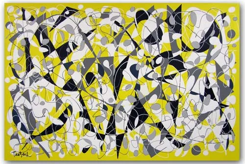
Recently I've been interested in the patterns made with overlapping lines that can be filled in with color to draw the eye across a canvas.  I usually begin by painting a solid background color and letting it dry before beginning to draw the lines.  In "Concatenation," I painted the whole canvas yellow.  Then I drew lines in white, gray and black. 

I was conscious, while filling in spaces with white, gray and black paint, of the patterns and connections being made between shapes.  There are various paths set up, depending on whether you follow the white, the gray, or the black connections. 

Concatenation, 60" x 40" 

Concatenation, 60" x 40"


In "Pecking Order Triptych," I painted three vertical canvases, each 10" x 48," in a light teal for the background.  Then I drew the lines in white, lime, teal and Prussian Blue.  I worked on all three canvases at once, developing each color pattern on all three before going to the next color.  By working on them all at the same time, I was able to ensure that the three panels would work together as a whole when hung side by side.  They also work if spaced further apart, depending on the room and space they are hung.

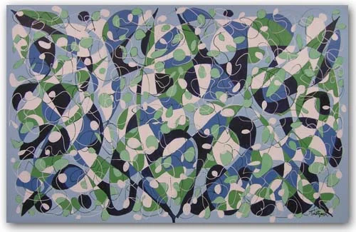
In "Sea Escape," which is a very large canvas (72" x 46"), I painted the background a light blue.  Then I drew lines in white and Prussian Blue.  This painting was more problematic, perhaps because of its large size.  I filled in spaces with white, pale green, a darker green, a medium blue, and Prussian Blue.  Sometimes I had to paint over one color because it didn't work.  Finally, I felt I'd gotten to the point where the image worked as a whole as well as in its parts. 

Sea Escape, 72" x 46"

Sea Escape, 72" x 46"

Which of the above abstract pattern paintings do you think is most successful?  Which one appeals to you the most?